Clutter by design becomes apparent when a countertop’s patterns, colours or textures conflict with the rest of the kitchen. Busy surfaces cause even a clean environment to seem chaotic, diverting emphasis from useful areas. Selecting a countertop that complements cabinetry, flooring, and lighting helps preserve visual stability and calm.
Clutter By Design 1: Pattern Overload
Overloading is among the most frequent ways the unsuitable kitchen or dining room countertop material choice creates visual noise. Countertops featuring excessively vibrant patterns such as strong veining, dense speckling, or marble effects with high contrast can quickly dominate the visual field and provide the eye nowhere to relax.
Rather than acting as a foundation surface, the counter stands out prominently in the room and challenges cabinet lines, backsplash elements, even ordinary items rested on it. Particularly affected are smaller kitchens, where limited space raises visual complexity and gives the area a disorderly appearance even while it is immaculate.
The outcome could seem chaotic instead than deliberately planned when mixed with other patterned components such as textured cupboard doors, tiled backsplash, or wooden grain floors. Moreover making the design hierarchy complex, pattern overload makes it difficult to distinguish essential concepts from ancillary information. The countertop pulls attention from craftsmanship, design, and functional flow rather than improving the overall appearance.
This never-ending visual stimulus can finally seem stifling, hence compromising the quiet and order excellent kitchen designs hope to provide. A counter matches its rather than battling its surroundings. Maintaining balance so that the room seems purposeful, consistent, and visually calm rather than overpowered by design depends on selecting a surface with a more subdued design, subdued contrast, or regular visual cadence.
Clutter By Design 2: Material Mismatches

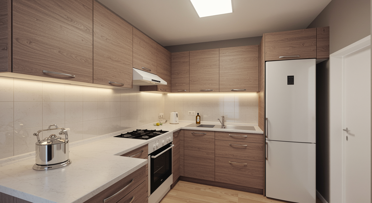
Material mismatches are among the most common but under appreciated causes of visual clutter in kitchen design, especially in terms of countertop choice. A countertop not aligned with the general design vocabulary of the space will immediately make the kitchen appear untidy even if it is perfect.
For example, matching a very smooth, modern quartz surface with rough wood cabinets creates a visual discord whereby conflicting forms compete for prominence rather than complementing each other. This fight muddles visual flow and makes the place messy and unsettling. An industrial concrete-look countertop in a small, old-fashioned kitchen can thus appear heavy and misplaced, catching the eye for the improper reasons.
Rather than the material itself, the dish’s lack of harmony among textures, finishes, and design intent is the issue. Sleek versus traditional or matte versus ornate countertops provide another aesthetic language and generate needless contrast that appears more like clutter than personality. Visually, these discrepancies might wear out the kitchen over time as the eye keeps trying to reconcile opposing elements.
A chosen countertop should act as a tying surface, softly uniting cabinet, backsplash, and flooring. When the material feels right, the kitchen seems more tranquil, more deliberate, and visually symmetrical. When it doesn’t, the countertop becomes a source of design noise, hence undermining the sense of harmony that defines a meticulously designed room.
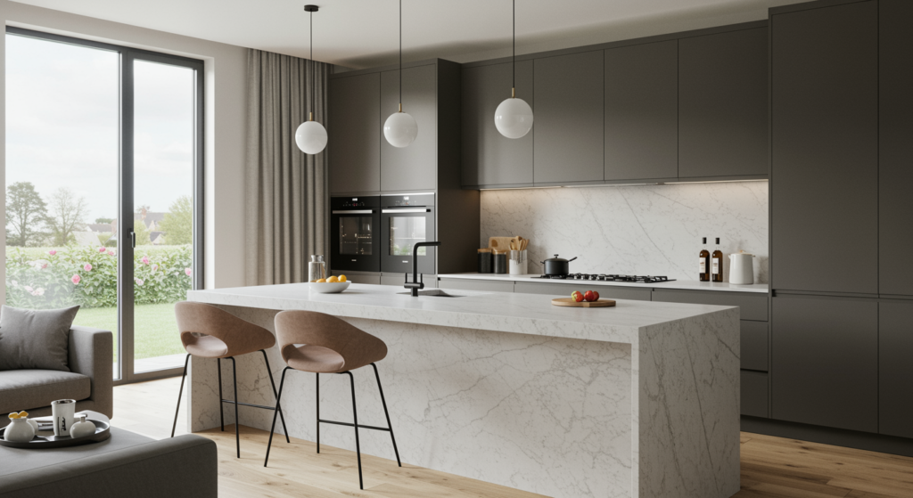
Clutter By Design 3: Colour Confusion
Colour misinterpretation is one of the most often ways a countertop unintentionally produces visual noise in a bathroom or kitchen. When the countertop colour clashes with surrounding elements including cabinets, wall finishes, flooring, or even appliances, the space can seem disjointed and overpowering rather than coordinated.
Combining, say, a cool-toned grey or stark white counter with warm wood cabinets and beige walls will create a mild but unrelenting tension, hence giving the space a somewhat unstable appearance. Instead of the eye sweeping the space, it jumps from one opposing hue to another, hence disrupting visual flow. Open-concept designs where the countertop is seen from many sides and must visually match with adjacent living or dining areas are particularly known for this impact.
Bright or contemporary countertop colours can also cause colour confusion and make the surface stick out unusually rather than merge well if they lack supporting tones elsewhere in the room. This difference can make the room appear cluttered over time as the colours never completely match one other even when it is physically clean and well-ordered. Especially in smaller kitchens, mismatched colour temperatures or high-contrast combinations can magnify visual disorder, hence making the room appear thicker than it really is.
A well-picked countertop colour should function visually to link the surfaces and materials all about. By neglecting colour harmony, the countertop becomes a distraction instead of balance, hence proving that design itself can create clutter rather than only via needless objects.
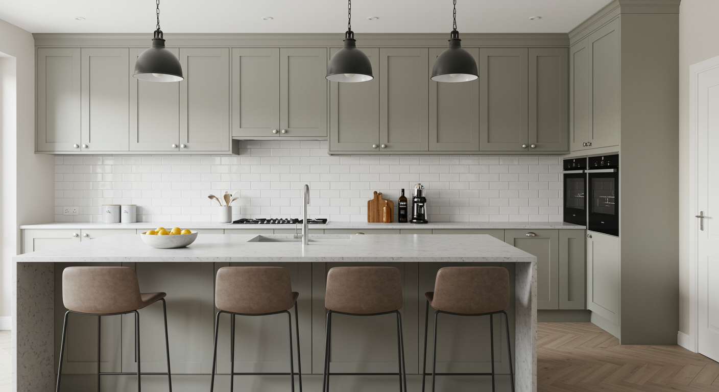
Clutter By Design 4: Too Much Texture

Among the most under appreciated sources of visual clutter in kitchen design is the texture of the countertop. Though texture can give a space depth, interest, and a tactile element, too much of it can overload the eye and cause a sense of disorder even in a precisely planned kitchen.
Countertops with large veined marble, bold swirls, or layered, multi-tonal patterns constantly catch the eye, leaving almost no area for it to settle. This gets very challenging with patterned backsplashes, textured flooring, or ornate cabinetry as the several surfaces fight for visual control. Even clean counters may seem messy if their surface is too aesthetically active; hence, emphasising little spills, crumbs, or cutlery right away and encouraging order.
Textured surfaces also change how other characteristics are perceived: simple cabinet hardware could be neglected; colour coordination could seem discordant; and the overall harmony of the room is disturbed. Designers usually advocate balance, claiming that when countertops have a lot of texture the surrounding surfaces remain quiet and neutral, hence allowing the substance to be a statement instead of a source of misunderstanding.
Finally overworking texture transforms a surface meant for beauty and utility into a visual battlefield in which the countertop fights for attention against all other components in the room, hence adding mess instead of improving the area.
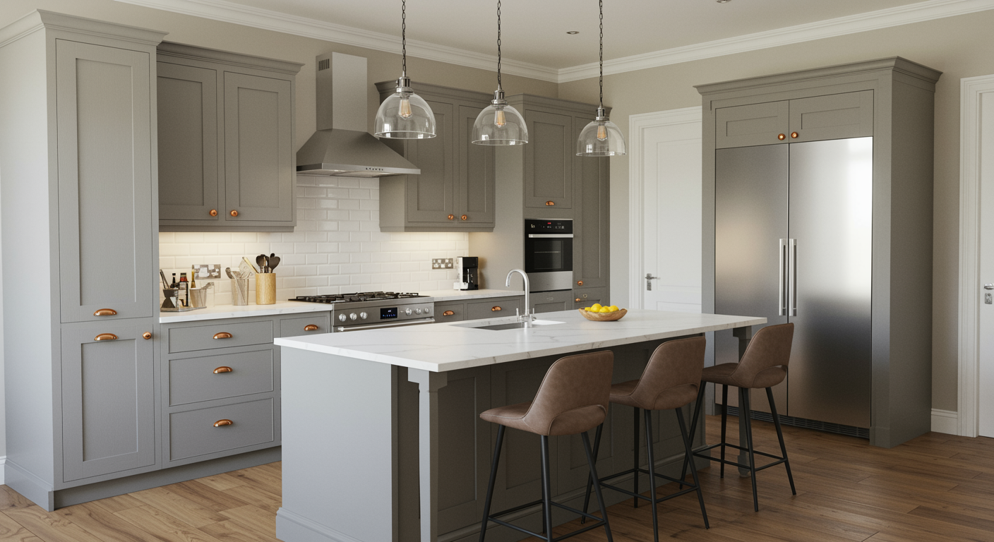
Clutter By Design 5: Mismatch With Functional Zones
Through a conflict with practical areas, a counter can generate visual noise in one of the most subdued yet effective ways. Different zones in a well-designed kitchen — food preparation, cooking, cleaning, and casual dining, for instance should be visibly separated to enable the eye to easily traverse the area.
Still, the outcome can be disoriented and hectic if the countertop selection disregards these areas. An island covered in a very patterned or contrasting countertop that conflicts with the perimeter surfaces, for example, can draw excessive attention and so disturb the visual flow and so make it challenging to instinctively recognise separate work spaces.
Likewise, employing the same bold, active design across all functional areas in a large kitchen can flatten the area, thereby eliminating the natural dividers that aid the brain in task organisation. Even small changes in tone, texture, or material can give visual cues that delineate areas and direct behaviour and movement. The kitchen not only seems messy when these signals are absent or ignored but also can affect usability as the eye fights to adequately interpret the space.
Furthermore, a counter that is visually overpowering in busy locations can eclipse surrounding areas, making them appear secondary or forgotten. Fundamentally, a countertop mismatches functional areas causes a sort of sensory overload wherein competing visual components undercut the practical design. Selecting fabrics and patterns that honour and emphasise functional areas guarantees clarity, harmony, and a more serene, orderly kitchen surroundings.