Outdated countertop signs are usually immediately apparent from worn surfaces and faded colours to obvious damage interrupting the general appeal of the kitchen. They indicate a lack of maintenance, poor durability, and a design that is out of line with current criteria. These crimson flags can eventually lower the perceived value and utility of the entire area.
Outdated Countertop Signs To Be Weary Of
1. Loud, Busy Patterns That Overwhelm the Space
Among the most evident indications that a kitchen has lost touch with modern design sensibilities are loud, extra countertop patterns that swiftly identify the area as too big and antique. Instead of balancing the room or using rich colour combinations or heavy speckling, these surfaces often exhibit strong, chaotic veining overwhelming the whole area.
The countertop draws attention for all the incorrect reasons as it clashes with cupboards, splashes, and flooring rather than being a neutral base. Even in an otherwise clean kitchen, this produces a visual disorder that makes the space seem smaller and less connected. Another problem with these strong patterns is that they frequently trap the kitchen into a particular period particularly the late 1990s and early 2000s — making updating the nearby features without a full makeover difficult.
Homeowners could find that even small changes such as cabinet painting or fixture replacement do not help in area planning since the countertop always catches attention. Furthermore, hectic patterns can highlight daily wear and tear more noticeably in an unattractive manner as stains, chips, or discolouration cover an already messy surface.
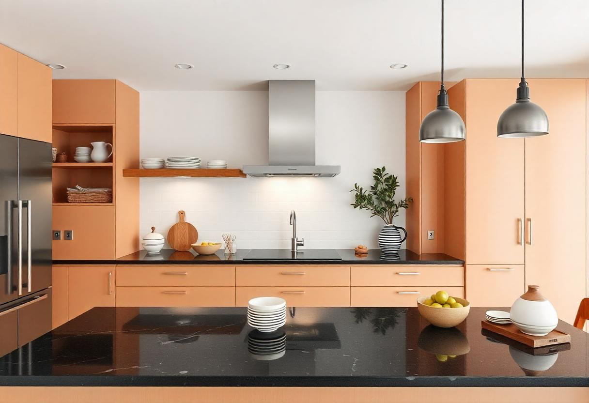
In today’s design context, when simplicity, muted veining, and tonal harmony are much treasured, bright countertops stand out as a clear signal that not only shows dated stylistic choices but also a want of visual balance and careful design integration within the kitchen.
2. Dated Colour Choices

Often acting as a visual indicator tying a kitchen strongly in the past, dated colour choices are among the most evident and unambiguous indicators of an obsolete counter top. Pink, mint green, yellow-beige, and deeply speckled brown granite once trendy often clash drastically with current design palettes that demand neutral, crisp, cohesive tones.
These older hues can produce a remarkable contrast with contemporary cabinets especially whites, blacks, and natural wood finishes that makes the entire kitchen seem messy rather than harmonious. How these colours affect lighting and spatial perception is yet another important factor: warmer, muddier tones can make a room seem darker, smaller, and less friendly, while cooler, streamlined palettes increase brightness and openness.
Dated colours also carry with them excessively busy patterns or artificial-looking surfaces, so worsening the impression of visual chaos. From the buyer’s point of view, such counters imply a possible need for repair in addition to an aesthetic issue, so lowering expected value immediately.
Though the material itself is still usable, the out-of-date colour can obstruct other kitchen improvements. Countertops in old colours are finally clear red indications since they impede design flow, lower visual appeal, and suggest that the room has not evolved with current trends thus, they are one of the first features designers and homeowners check to modernise.
3. Visible Seams and Poor Installation
Visible seams and poor installation are among the most obvious and telling signs that a countertop is antiquated; often pointing to more serious issues beyond basic appearance. The presence of extremely visible joints where two slabs meet, particularly when patterns or veins don’t line up exactly, hence producing an uneven and mismatched appearance, is one of the most clear qualities.
In older kitchens, these joints can occasionally be large, uneven, or badly packed; they grab attention and disrupt the visual surface flow. Gaps between the countertop and adjacent walls, sinks, or backsplashes are another red flag since they both look incomplete and catch moisture and debris, therefore generating long-term upkeep and cleanliness problems.
Uneven borders or height differences across sections of the counter point to bad workmanship and could make daily chores like cooking difficult or even hazardous. These installation mistakes might worsen with age as seals split, seams darken, or edges rise to emphasise the countertop’s age and poor toughness.
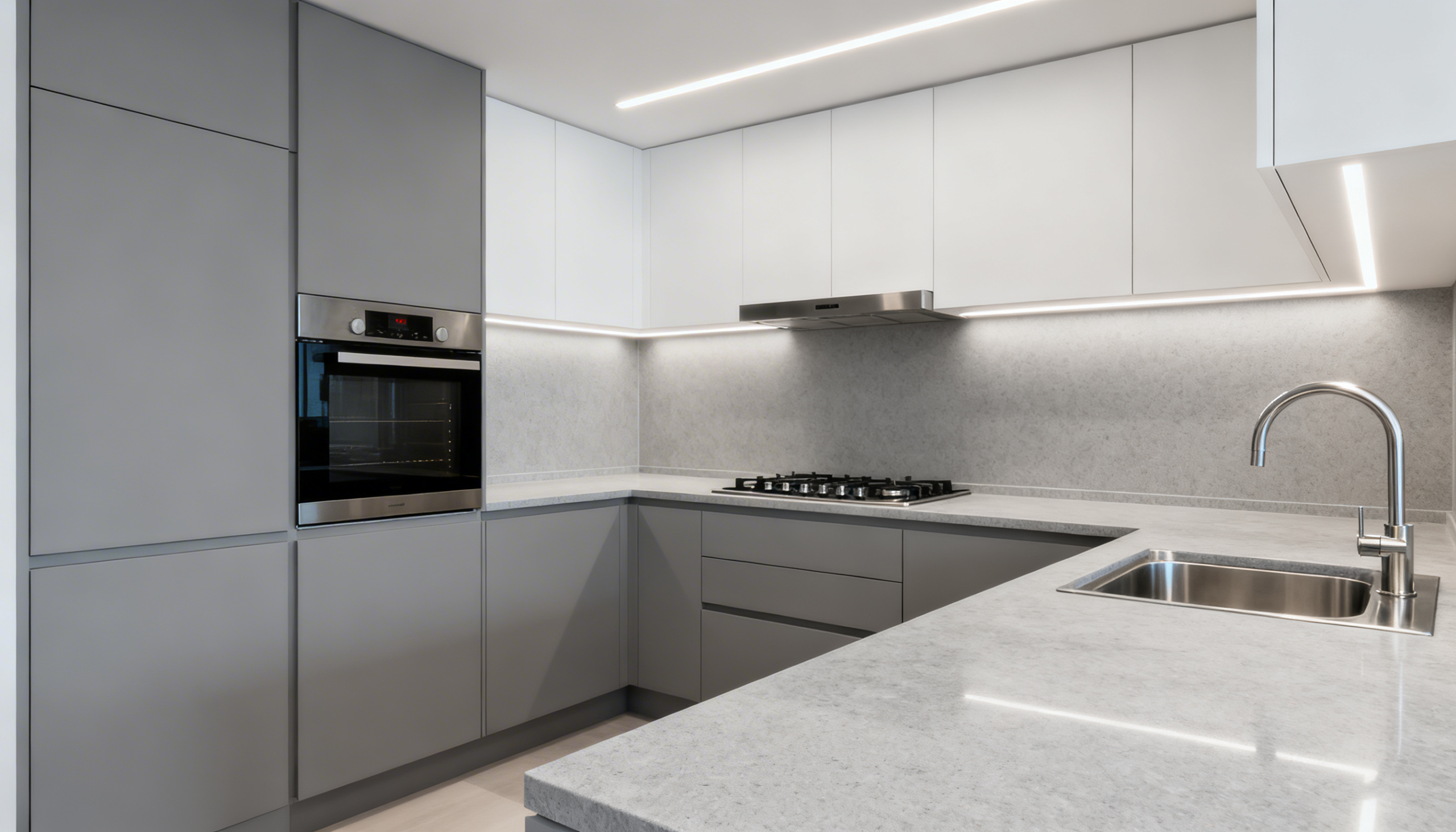
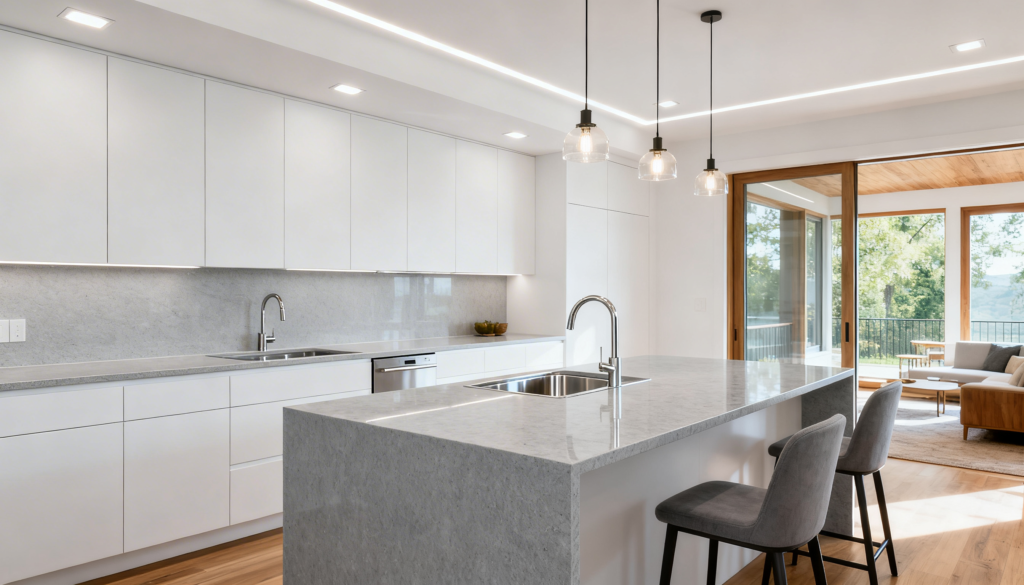
From a design perspective, modern kitchens emphasise smooth, unbroken surfaces to portray precision and quality; therefore, any disruption in that consistency quickly dates the space. Finally, visible seams and poor installation devalue the entire kitchen rather than just looks; hence, they present an obvious warning flag that customers and householders are quick to see and pass on.
4. Mismatch with Overall Kitchen Style

The ugly match of an ancient countertop with the overall aesthetic of the kitchen creates visual tension impossible to ignore. In a recently renovated room, countertops not in harmony with the cabinets, backsplash, or floor might be seen as a strong red warning.
For example, slick flat-panel cabinets matched with powerfully spotted granite or laminate in classic colours like beige or pink run counter to the contemporary, clean aesthetic many households want. Similarly, a minimalist kitchen decorated with strong, striking patterns can seem aesthetically chaotic with understated colour palettes and handleless cabinets.
Many homeowners try to create an unbalanced appearance by modernising certain features while keeping outdated countertops to cut expenses. It shows design planning conflicts that might damage perceived value beyond its beauty, particularly for potential purchasers who view the kitchen as a cohesive entity rather than as discrete pieces.
A well-designed kitchen is one where colours, finishes, and materials come together just right, therefore defining harmony. Counters date the room and so contradict the overall design notion when they cannot foster that oneness. At last, this disagreement makes the kitchen appear less finished and less thoughtfully planned, therefore supporting the idea that the space has to be completely rebuilt and more integrated.
5. Tile Countertops with Thick Grout Lines
Thick grout line tile counts among the most obvious indications of an antiquated kitchen and a major warning signal for both homeowners and potential buyers. Once appreciated for their affordable pricing and DIY-friendly installation, these items currently fall short both aesthetically and practically.
The most obvious problem is the grout itself — big, porous lines that rapidly catch dirt, oil, and bacteria because thorough cleaning is always difficult. Grout fades or stains over time, therefore even a well-kept kitchen looks clearly elderly and unclean. Apart from cleanliness concerns, the uneven surface of tiled countertops obstructs use; rolling dough, setting small appliances, or even arranging glassware may be difficult due to the modest height variations between tiles.
Unnecessary busyness results from thick grout lines, which also go against current demand for clean, perfect surfaces like quartz or solid stone. The grid-like arrangement they generate adds unwelcome busyness. This jumbled appearance may make the entire kitchen appear outdated, therefore compromising the contemporary design emphasis on flow and coherence.
Common over time are cracked tiles or crumbling grout, which point to wear and lack of durability. Hence, tile counters with notable grout lines support their standing as an outdated design preference that many want to remove by not just sacrificing cleanliness and usefulness but also by lowering the total worth and visual appeal of a kitchen.